


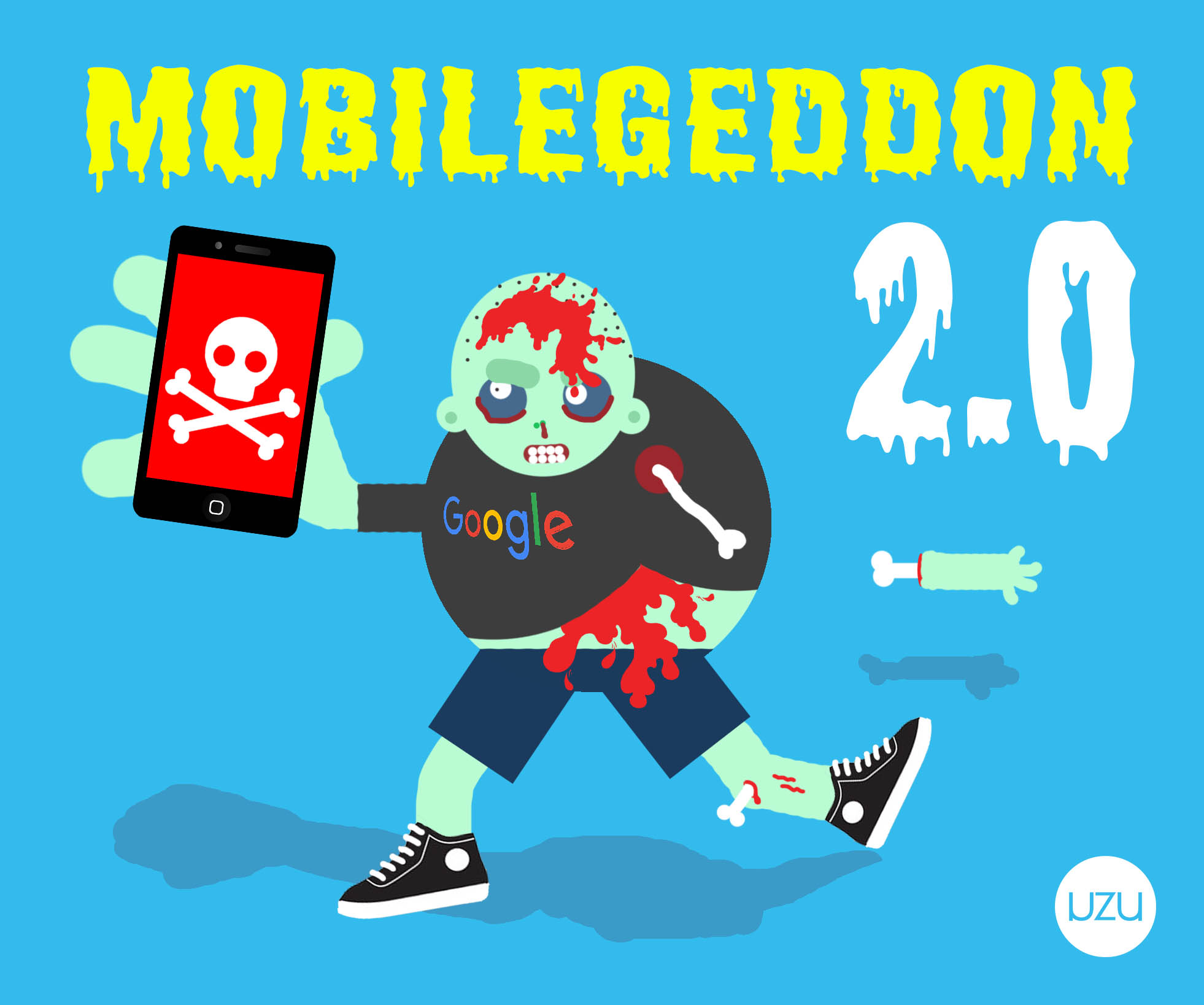
It sounds so ominous! MobileGeddon 2.0! Can we survive it???
You’ll be fine. Probably. 🙂
And while the update is being named MobileGeddon 2 or 2.0 by many, it’s really not that bad. However, you shouldn’t wait too long to fix things!
History of Google’s Mobile-Friendly Update
This update of Google’s Mobile-Friendly update, (or MobileGeddon 2.0 as I and some others are referring to it), is the 2nd major one concerning whether or not sites meet Google’s Mobile-Friendly guidlines. On March 16, 2016, on the Official Google Webmaster Blog, Google made the annoucement:
“Today we’re announcing that beginning in May, we’ll start rolling out an update to mobile search results that increases the effect of the ranking signal to help our users find even more pages that are relevant and mobile-friendly.
That update rolled out on May 12, just last week. While Google’s goal is to always help return the best search results, based on the user’s intention, in fabulous Google fashion though they didn’t share how much of an impact it expects the changes to have.
In February 2015, Google announced plans to roll out mobile ranking changes on April 21 (an unprecedented move — the company almost never announces algorithm changes in advance).
For nearly a year, Google has used mobile-friendliness as a ranking factor in searches. But now the search giant is taking it one step further.
The New Update is Supposed To Give a Ranking Boost for Mobile-Friendly Sites
As of this last week, all pages of your website must be mobile-optimized or your rank in Google’s search results may drop. However while many are calling this update “MobileGeddon 2” it doesn’t have to be the Zombie Apocalypse for your website.
What does it mean to be Mobile-Friendly?
A website or webpage is eligible for the “mobile-friendly” seal of approval if it meets the following criteria, as detected in real-time by the Googlebot:
1. Avoids software that isn’t common on mobile devices (like Flash)
2. Uses text that is readable without zooming
3. Sizes content to the screen so users don’t have to scroll horizontally or zoom
4. Places links far enough apart so that the intended one can be easily tapped
Google recommends using a base font size of at least 16 CSS pixels, then resizing based on the font’s properties. For detailed instructions, follow their actual guidelines here.
How to check if your website is mobile-friendly
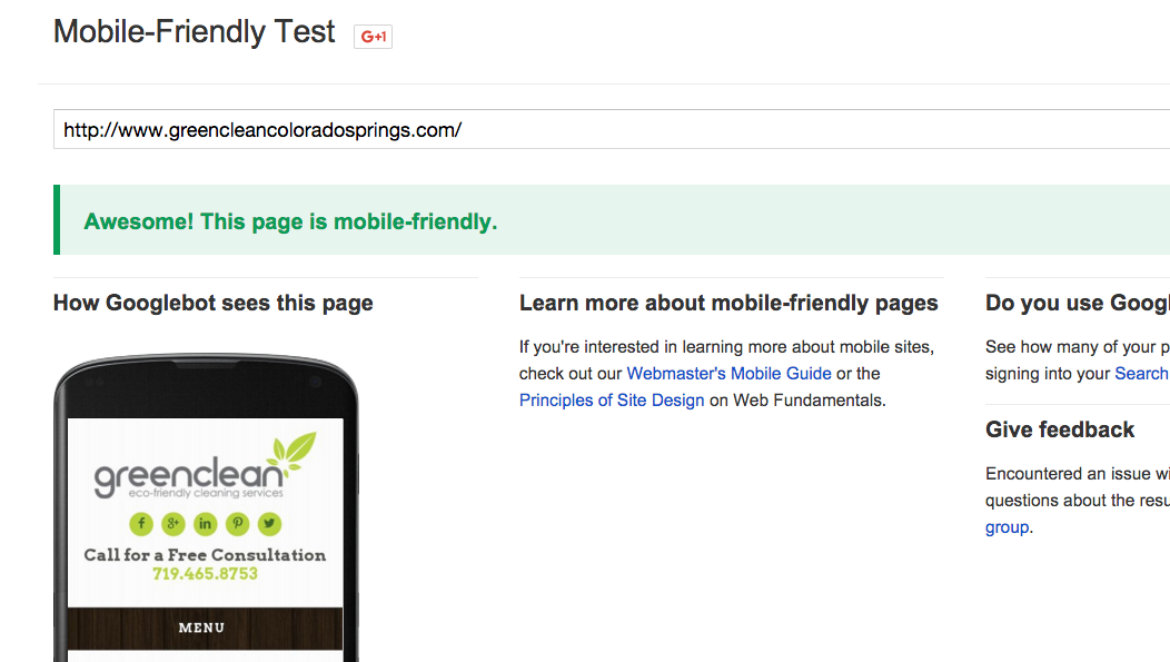
One of the best ways to check is to use Google’s Mobile-Friendly Test Tool to see if your site is considered to be mobile-friendly.
Below is an example of how one of our clients stacks up against Google’s test.
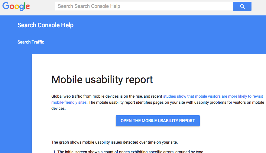
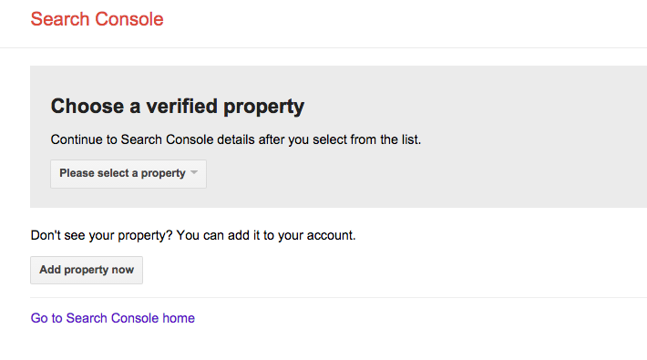
You can also check through the Mobile Usability Report through Google’s Search Console to scan one of your verified properties. (see screenshots below)
In another statement concerning the mobile-friendly update, however, Google’s software engineer, Klemen Kloboves gave us a great reminder of the importance of focused quality content:
”… remember, the intent of the search query is still a very strong signal – so even if a page with high quality content is not mobile-friendly, it could still rank well if it has great, relevant content.”
Colorado Springs Mobile-Friendly Web Design
Having SEO problems based on the update? It’s not too late to reclaim your rankings and ensure Google searchers are still able to find your website. Whether creating a separate mobile-friendly website for your current design, or updating to responsive web design (RWD) for your site, our designers are available to make the appropriate updates to your site and bring it into the age of mobile-friendly.
Do you have any tips that weren’t mentioned here? Post any questions or advice you’ve got in the comments below!