


Have you ever visited a website on your smartphone, only to realize that you have to zoom in just to read the website’s content; or have you ever had dig your way through various drop down menus just to find out how late your favorite coffee shop is open?
We sure have. In our experience, these seemingly miniscule inconveniences have at times been the factor which determines whether a company gets our business or not.
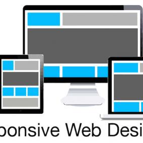
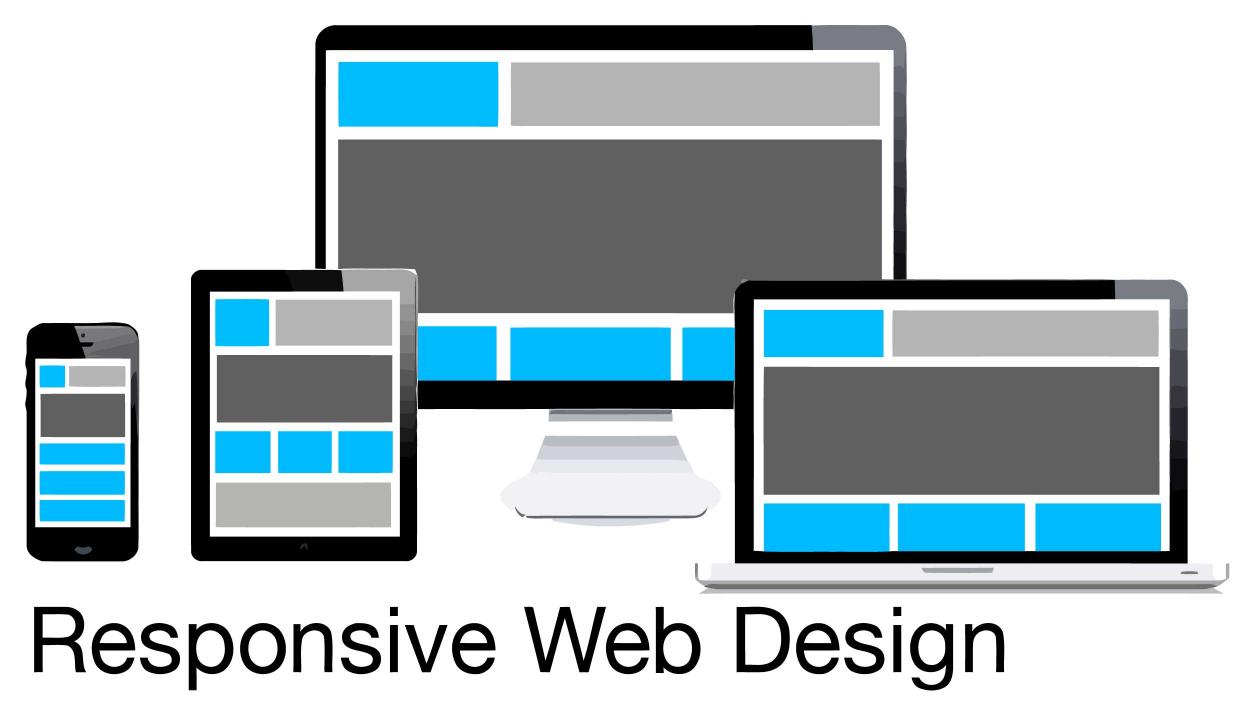
That’s where responsive web design–RWD for short–comes in. RWD is the practice of creating web experiences that are optimized for each of the devices that they are viewed on. These responsive websites are designed to adapt to the screen size of various mobile, tablet, and desktop web browsers.
Where did the need for RWD arise?
RWD started to rise in importance as the number of mobile web users began to increase. This rise in mobile web browsing exploded with the launch of the first smartphones. As the number of mobile web users increased, a demand was created for optimized mobile websites. RWD provides this by furnishing the best possible user experience on every screen and every device.
So what does a responsive website look like?
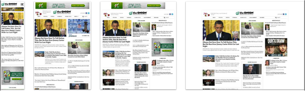
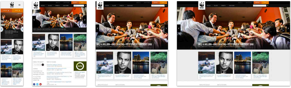
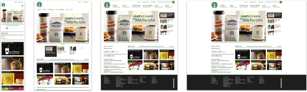
Here are a few examples of responsive websites from around the web. Take a minute to look at these websites and see how they react when you resize your browser window.
What does RWD look like for me?
Now that we’ve seen what RWD can look like, we can now look at some of the basics of what makes up a responsive site. We’ll go over two important RWD principles here.
Mobile-First Content Strategy
“When someone visits my website on a mobile device, what is it that they look for the most?” – this is just one of many questions that must be asked when developing a responsive website. Most mobile visitors have a specific goal when they are visiting your site. Contact information and hours of operation are two of the most common things that mobile visitors are looking for. If this information is not clearly available when one first visits your website, the chance of this being their only interaction with your business greatly increases.
Of course, there is more to mobile-first responsive design than a prominently-displayed telephone number. Another key element of “mobile-first” design is prioritizing content. With RWD comes the idea that as a screen size changes, the way that content is organized can and should also be changed–to an extent. Content can be shifted around, temporarily hidden from view, or even removed completely at various screen sizes. It is important to prioritize content so that users have the quickest access to the content most appropriate to them.
Flexible Images
By default, images displayed in a web browser are of a single, static size. With the onset of responsive design, new techniques must be created so that not only text, but also images can be responsive and adapt to their current viewpoint. For instance, sending the same large background image intended for desktop to a mobile browser would be a waste of bandwidth, and it could have a noticeable impact on the loading speed of your site. Instead, creating multiple versions of the same image can help to speed up the experience for users on slower Internet connections. Also, as high-resolution displays increase in popularity, it becomes necessary to adopt a standard and double resolution image for image assets so that your website is displayed at the highest possible quality for users who have access to such displays.
RWD is the future!
Because the web is constantly evolving, it is becoming more and more important to remain on the bleeding edge of web design technologies. What began with the rise of content management systems, social media, and web 2.0 is now giving rise to HTML5 and CSS3-based web applications with a strong foundation in responsive design. As more and more websites adopt this technique, those sites which choose to ignore it will start to look out of date. We encourage you to jump on the RWD bandwagon. Be on the lookout for more posts about RWD in the coming weeks and months.
nice designs
This is wonderful. The future is here.
Thanks! This is just the beginning of what’s coming. 🙂
Yes, … Learning as Living and Loving ALL devices, … and SEE Great Increase of Mobile PC’s and Smart Phone Devices… and YES, … “RWD is the future!” 🙂 Thank You.
And thank you for reading. Cheers!
Contact information and hours of operation are two of the most common things that mobile visitors are looking for. That’s right !
Absolutely. Thanks for reading. Cheers!
nice going
Appreciate that. Thanks for reading!